Ch. 1 Descriptive Statistics
Sections covered: all (skim 1.1)
1.2 Pictorial and Tabular Methods in Descriptive Statistics
Skip: Example 1.7, p. 15 (double-digit leaves)
Skip: “Dotplots,” pp. 15-16
Stem-and-leaf plots
Ex: The following are the listing prices (in thousands of $) of one-bedroom apartments in Morningside Heights in 2016: 379, 425, 450, 450, 499, 529, 535, 535, 545, 599, 665, 675, 699, 699, 725, 725, 745, 799
Draw a stem an leaf plot of this data:
- Create a new variable (we’ll call it “prices”). Note: we use the syntax <- c() to generate new vectors.
prices <- c(379, 425, 450, 450, 499, 529, 535, 535, 545, 599, 665,
675, 699, 699, 725, 725, 745, 799)- Draw a stem and leaf plot
prices <- c(379, 425, 450, 450, 499, 529, 535, 535, 545, 599, 665,
            675, 699, 699, 725, 725, 745, 799)
stem(prices)
##
## The decimal point is 2 digit(s) to the right of the |
##
## 3 | 8
## 4 | 355
## 5 | 03445
## 6 | 078
## 7 | 00335
## 8 | 0The scale parameter will change the number of rows by the factor specified:
stem(prices, scale = 2)##
## The decimal point is 2 digit(s) to the right of the |
##
## 3 | 8
## 4 | 3
## 4 | 55
## 5 | 0344
## 5 | 5
## 6 | 0
## 6 | 78
## 7 | 0033
## 7 | 5
## 8 | 0
stem(prices, scale = .5)##
## The decimal point is 2 digit(s) to the right of the |
##
## 2 | 8
## 4 | 35503445
## 6 | 07800335
## 8 | 0Frequency histogram
If you want to create a frequency histogram of this data you use the following:
prices <- c(379, 425, 450, 450, 499, 529, 535, 535, 545, 599, 665,
            675, 699, 699, 725, 725, 745, 799)

hist(prices)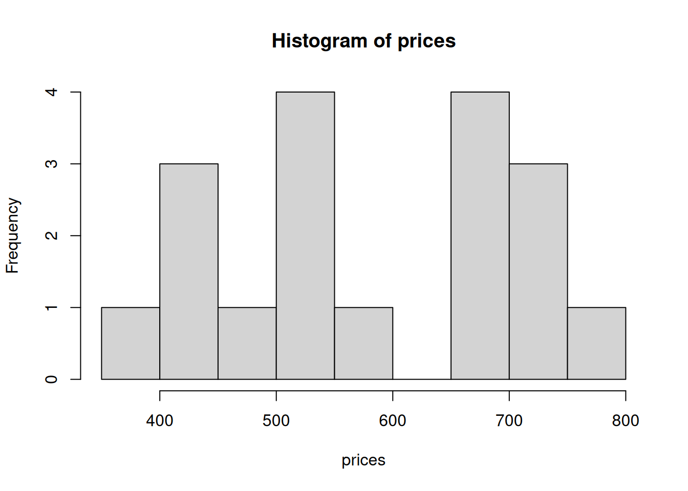
Note: histograms are drawn with unbinned data. R does the binning in the process of drawing the histogram. This means that the program chooses the size of the bins for you.
To add specific bin sizes and colors to your histogram, you can use the following syntax:
prices <- c(379, 425, 450, 450, 499, 529, 535, 535, 545, 599, 665,
            675, 699, 699, 725, 725, 745, 799)
hist(prices, breaks = c(300, 400, 500, 600, 700, 800),
     col = "lightblue")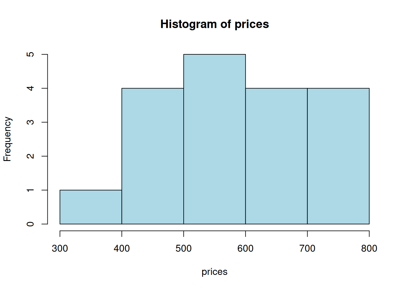
Density histogram
We use an almost identical syntax to generate density histograms, but add the parameter freq=FALSE – that is, not a frequency histogram.
prices <- c(379, 425, 450, 450, 499, 529, 535, 535, 545, 599, 665,
            675, 699, 699, 725, 725, 745, 799)

hist(prices, freq = FALSE,
     breaks = c(300, 400, 500, 600, 700, 800),
     col = "lightblue", las = 1)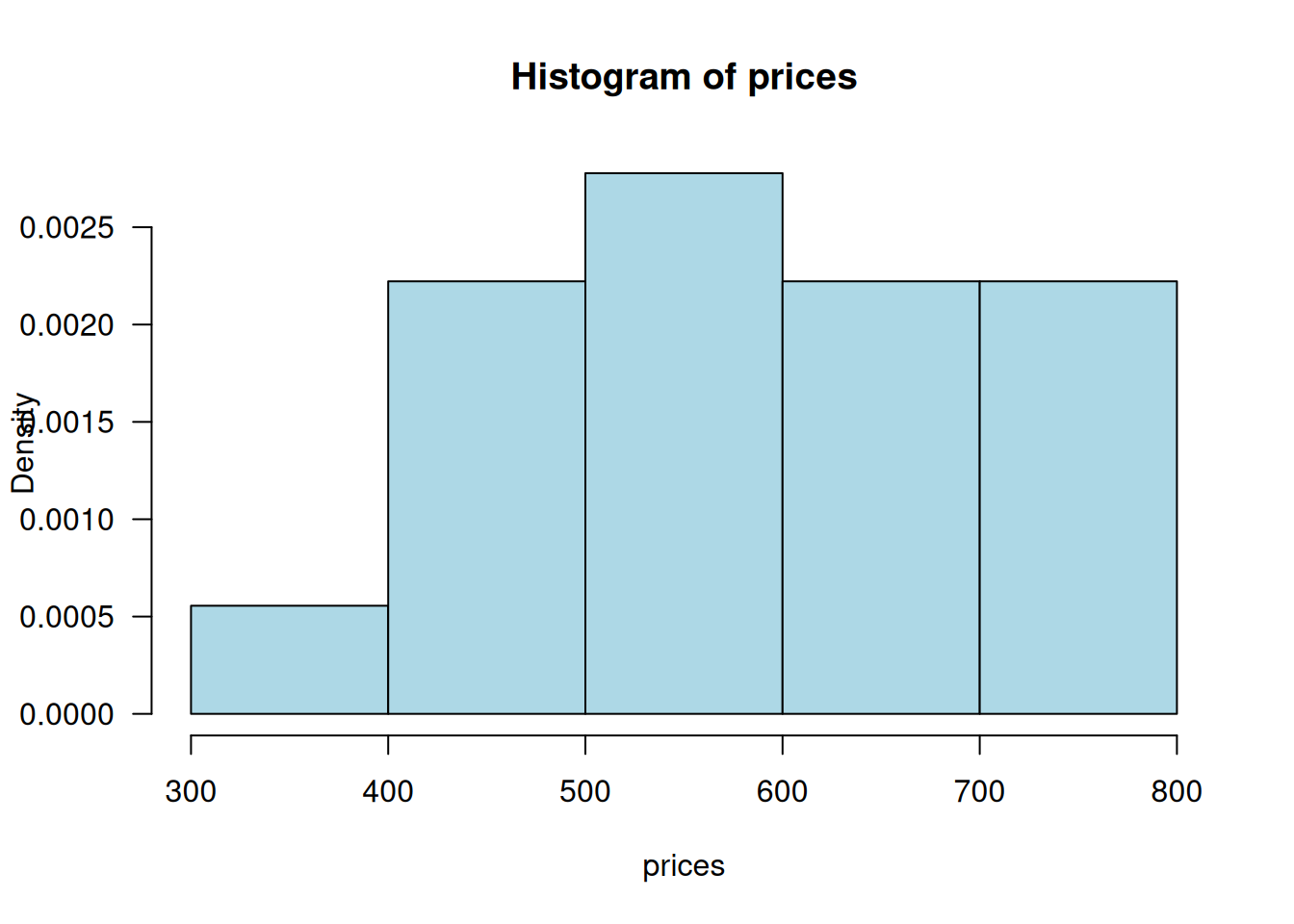
(las = 1 makes all the labels horizontal.)
1.3 Measures of location
Skip: Example 1.16, p. 33 (trimmed mean)
Skip: “Categorical Data and Sample Proportions,” p. 34 (We’ll return to this topic later.)
Consider the same dataset (prices). To find the mean, median, quartiles, and trimmed mean, we use the following syntax:
prices <- c(379, 425, 450, 450, 499, 529, 535, 535, 545, 599, 665,
            675, 699, 699, 725, 725, 745, 799)

mean(prices)
## [1] 593.2222
median(prices)## [1] 572
## quartiles
quantile(prices)
## 0% 25% 50% 75% 100%
## 379.0 506.5 572.0 699.0 799.0
## trimmed mean
mean(prices, trim = .1) ## 10% trimmed off each end
## [1] 593.751.4 Measures of variability
Skip: extreme outliers (p. 42)
We will define outliers for boxplots to be observations that are more than 1.5 times the fourth spread from the closest fourth. They may be indicated with either a solid or open circle (in contrast to the book which uses one for mild outliers and the other for extreme outliers.)
Numerical summaries
- Sample variance:
prices <- c(379, 425, 450, 450, 499, 529, 535, 535, 545, 599, 665,
            675, 699, 699, 725, 725, 745, 799)

var(prices)
## [1] 15981.48- Sample standard deviation:
## [1] 126.4179
sd(prices)## [1] 126.4179- Five number summary
(min, lower-hinge, median, upper-hinge, max)
fivenum(prices)## [1] 379 499 572 699 799If you want to generate a horizontal boxplot, use the following
Boxplots
prices <- c(379, 425, 450, 450, 499, 529, 535, 535, 545,
            599, 665, 675, 699, 699, 725, 725, 745, 799)

boxplot(prices)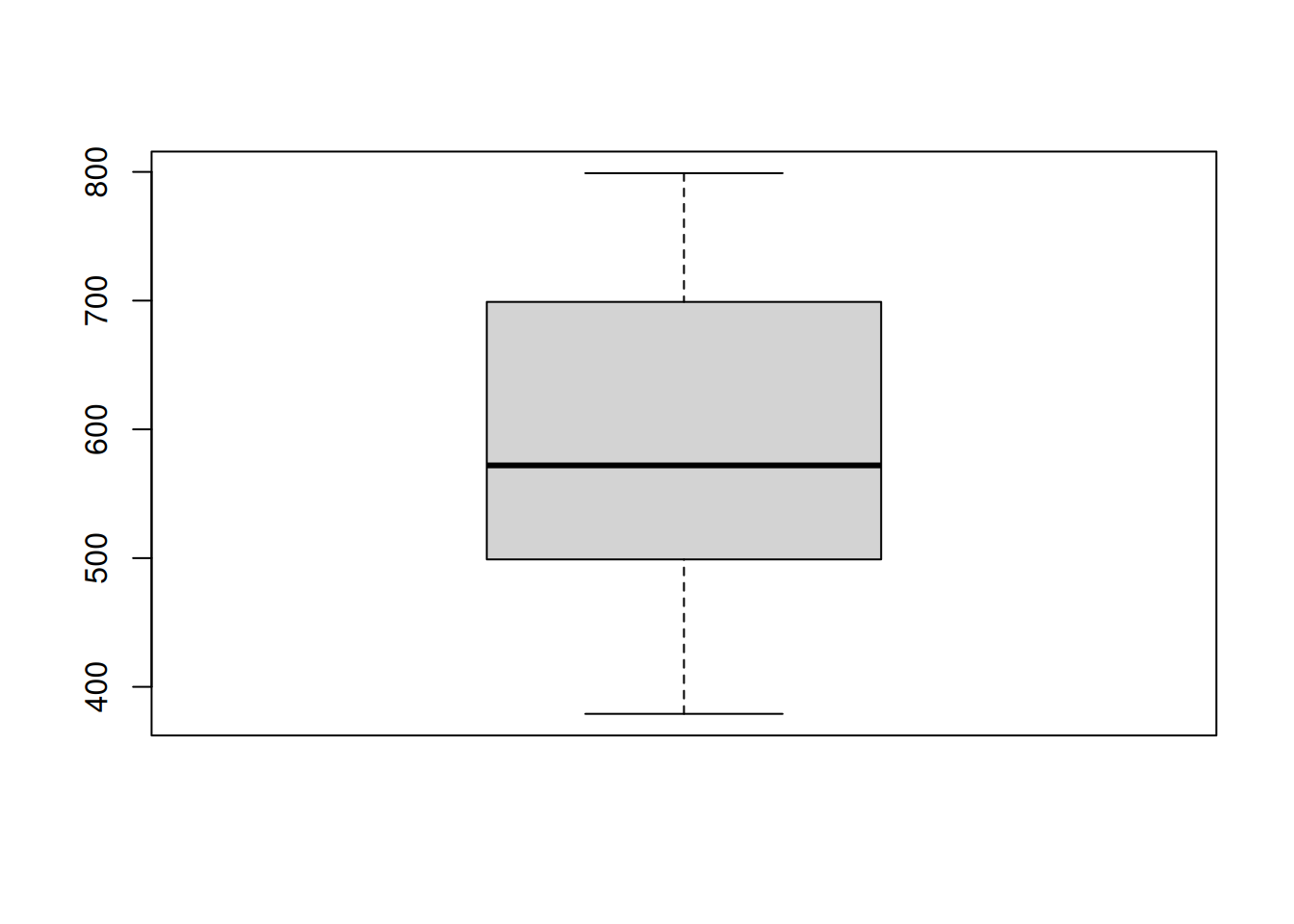
boxplot(prices, horizontal = TRUE)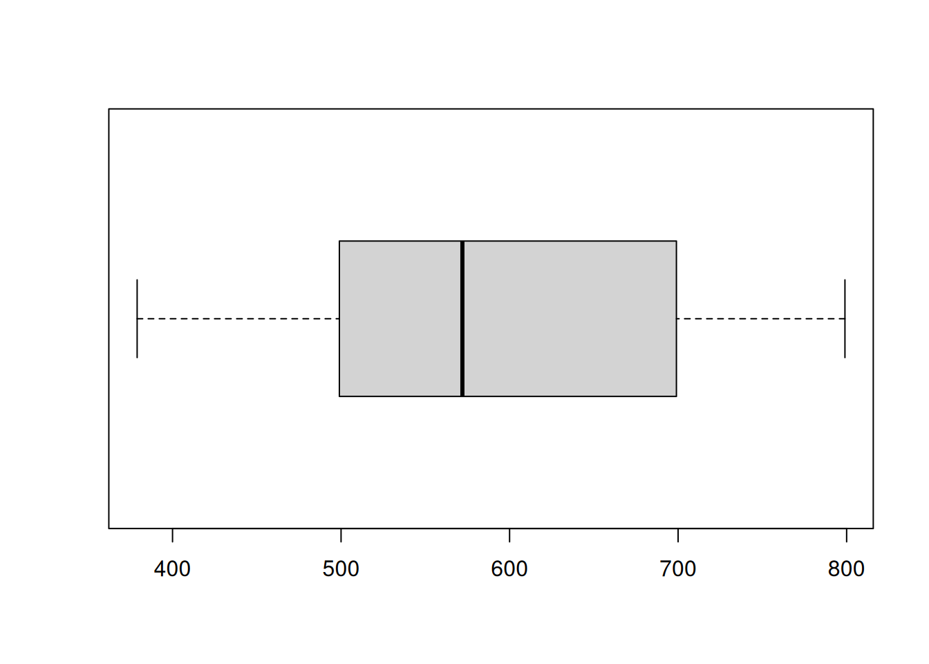
- Comparitive boxplots
A simple means to create multiple boxplots is to list the vectors that you wish to display. Note that to label the boxplots, use names =.
PTSD <- c(10, 20, 25, 28, 31, 35, 37, 38, 38, 39, 39, 42, 46)

Healthy <- c(23, 39, 40, 41, 43, 47, 51, 58, 63, 66, 67, 69, 72)

boxplot(PTSD, Healthy, names = c("PTSD", "Healthy"), horizontal = TRUE)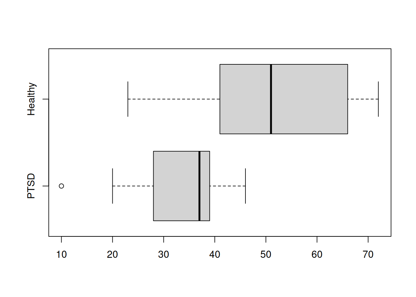
Practice Exercises
- Using the built-in dataset
ToothGrowthin R, visualize the data and comment on the effectiveness of different functions in the context.
[Ans]
# The first 5 rows of the data
head(ToothGrowth, 5)
## len supp dose
## 1 4.2 VC 0.5
## 2 11.5 VC 0.5
## 3 7.3 VC 0.5
## 4 5.8 VC 0.5
## 5 6.4 VC 0.5
# Five number summary
fivenum(ToothGrowth$len)
## [1] 4.20 12.55 19.25 25.35 33.90
# Boxplot
# '$' extracts the column by name
boxplot(ToothGrowth$len) 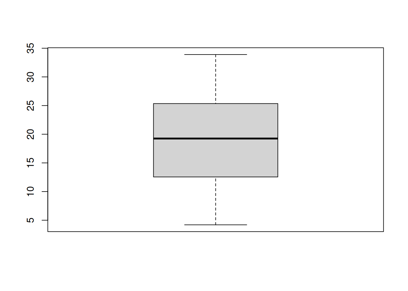
# Stem-and-leaf Plot
stem(ToothGrowth$len)
##
## The decimal point is 1 digit(s) to the right of the |
##
## 0 | 4
## 0 | 5667789
## 1 | 00001124
## 1 | 55555677777899
## 2 | 001222333344
## 2 | 55566666667779
## 3 | 0134
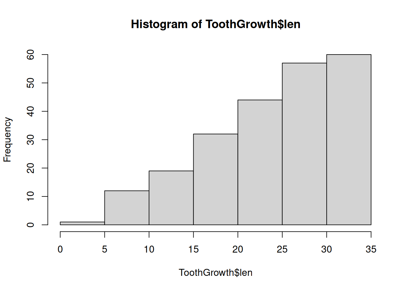
# Histogram
h <- hist(ToothGrowth$len)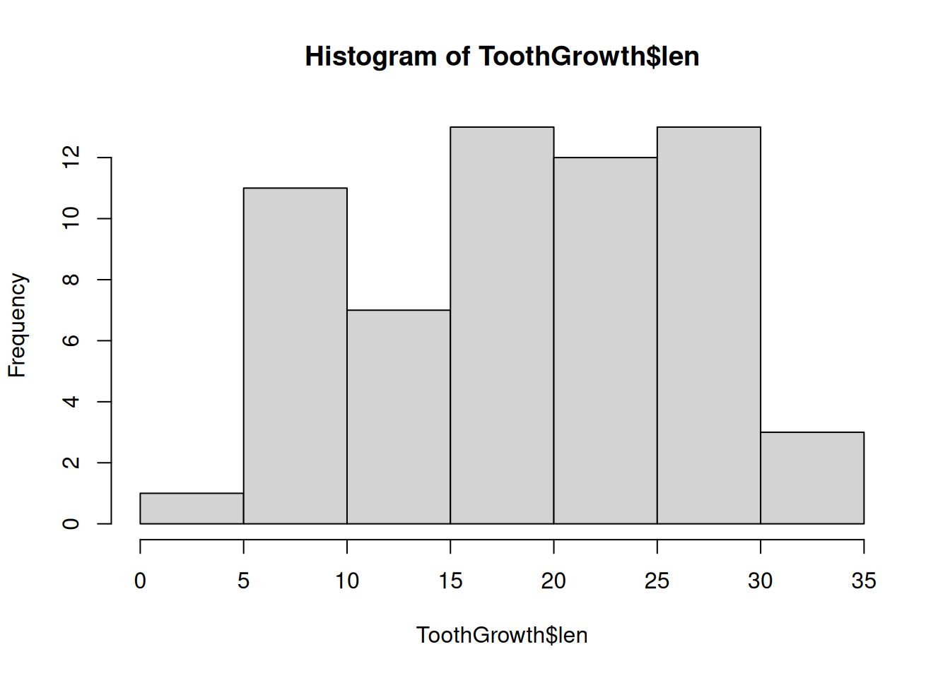
Summary of R functions
head(): directly see how the dataset looks; useful when the dataset is large and it’s difficult to display all rows and columns together.
fivenum(): returns the minimum value, lower fourth, median, upper fourth, and maximum value
boxplot(): visualizes the five number summary plus outliers. (It’s clear that the ToothGrowth data is not skewed.)
stem(): compares the number of data points that fall in different bins. (Here we can see that most values are between 20 and 29.)
hist(): draws a histogram – values are grouped in bins
cumsum(): takes a vector and returns the cumulative sums